 Textures are one of my favorite things to experiment with inside Photoshop Elements, and they can be used to enhance just about any image. However, placing them and using them can be a bit tricky, so I’ve come up with a sure-fire way of using them!
- Choose a photograph you’ll add your texture to. I’m going to use a portrait, but textures can look great over just about any photo.
- With your texture open (mine is a canvas book cover), go to the Select menu and choose All (PC: Control+A, Mac: Command+A).
- Go to the Edit menu and choose Copy (PC: Control+C, Mac: Command+C).
- Go to the photo you’re adding your texture to, and choose Edit > Paste (PC: Control+V, Mac: Command+V).
 y produce the texture on its own layer. If you need or want to resize your texture, use the Free Transform command (PC: Control+T, Mac: Command+T) to move it into place so that it covers your image. (If the orientation of your texture is off, remember that you can rotate any layer by choosing Image > Rotate > Rotate Layer Left 90°.)
 - In the Layers palette, change the blend mode of your texture layer to Overlay or Soft Light.
 ften because it’s a little bit more subtle.
 - Start to lower the opacity of the texture layer until you’re happy. Again, there isn’t a formula for this, so experiment!
- I’m going to burn in the edges of your texture layer a little bit more to help add a little bit of a vignette (and focus). So, make a duplicate of the texture layer (PC: Control+ J, Mac: Command+J), and on this duplicate layer, change the blend mode to Multiply.
- Select the Elliptical Marquee tool (NOT the Ellipse Custom Shape).
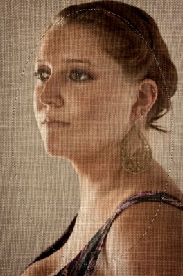
 es a little bit of room around all the edges, like the one below:
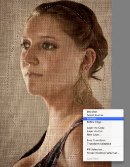
- Right-click or Control-click inside your oval selection to open up a drop down menu and choose Feather.
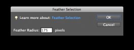
- Inside the Feather Selection dialog box, type in a number between 150 and 200 pixels (this will depend on the resolution of your image: the higher the resolution, the higher this pixel number should be) and press OK. You might not notice a change in the selection, but don’t worry about that.
- Now just press the Delete or Backspace key and voilá! Lower the opacity of the top texture layer in the Layers palette if you’d like. I usually lower mine to around 50%, depending on the image. Your final Layers palette should look something like this:


