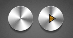
 The internet is saturated with tutorials on how to create web buttons in Photoshop, and if you’re anything like me, you’re probably ready to scream if you ever see another tired and dusty old tutorial showing how to make a “glossy” or “gel” button. If that’s the case, hopefully this tutorial is a bit different from those and will give you some helpful tips.
We’re going to be creating a stylish, detailed and realistic brushed steel button, reminiscent of steel dials on old fashioned stereo equipment. These are really fun and simple to make once you know the techniques and steps used to create them, and you’ll be able to modify or customize the steps to your liking to achieve the effects you prefer.
Step 1 – Set up your document space
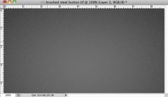
This step is really up to you, and will depend on the project you’re working on. For the purpose of this this tutorial, I’ve created a document that is 630 pixels wide by 333 pixels high. I’ve filled it with a mid-gray background, with darkened corners (I used the gradient tool on radial gradient setting). Then I added a slight noise effect (filter > add noise) to create a subtly textured background for my brushed steel button.
Step 2 – Creating the base of the brushed steel button
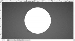
Create a circle in the middle of your document. Any color will do, because we’re going to use layer styles to colorize it to give it a brushed metal look. Name this layer “brushed steel button base” or something that will help you identify it as the base layer, as that is how I will be referring to this layer in this tutorial.
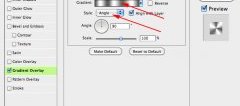
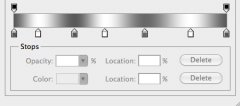
Double click on the circle layer preview to open the layer styles palette. Check the “gradient overlay” button. Next to “style” be sure the gradient is set to angle mode. The red arrows below show the settings you need to pay attention to and adjust.
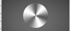
So now you should have something like the image below. The angled gradient created a very sleek silver circle that captures the highlights and reflections for our brushed steel button.
Step 3 – Texturing the brushed steel button
So what we have now would be great if we were just making a steel button, but since we’re looking for a brushed steel button, we’re going to push it a bit further to create the brushed, scratchy texture we need.
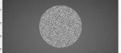
Make a selection of the circle layer (command-click on Mac, control-click on PC) and then click on Select > Modify > Expand. Enter a value of 5 pixels, and click okay. Add a new layer above your brushed steel button base layer. Fill this layer with a mid gray, and then clear your selection by clicking on Select > Deselect (command-D on Mac, control-D on PC). Click on Filter > Noise > Add Noise. For distribution, select uniform and for amount, set it at around 50%. Click okay. These dots are going to eventually form the brushed scratches on the brushed steel button.
Step 4 – Adding the beveled edge detail to the brushed steel button
As it stands right now, the texture of our brushed steel button is looking really good and pretty realistic, but it needs some depth to make it stand out more. It’s the details that are going to make this button really shine.

