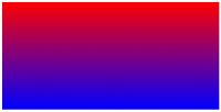
 Creating an image only for the purpose of displaying a gradient is inflexible, and is quickly becoming a bad practice. Unfortunately, at the time of this writing, they very well might still be required, but hopefully not for much longer. Thanks to Firefox and Safari/Chrome, we can now create powerful gradients with minimal effort. In this video quick tip, we'll examine some of the differences in syntax when working with the -moz and -webkit vendor prefixes.
Webkit
While Mozilla and Webkit generally adopt the same syntax for CSS3 properties, they unfortunately don't quite agree when it comes to gradients. Webkit was first to embrace gradients, and uses the following structure:
/* Syntax, taken from: */ -webkit-gradient(,
[, ]?,
[, ]? [, ]*) /* In practice... */ background: -webkit-gradient(linear, 0 0, 0 100%, from(red), to(blue));
Don't worry if your eyes gloss over at that syntax; mine did too! Just note that we require a comma-separated list of parameters.
- What type of gradient? (linear)
- X and Y axis coordinates of where to begin. (0 0 - or left-top corner)
- X and Y axis coordinates of where to conclude (0 100% - or left-bottom corner)
- What color to begin with? (from(red))
- What color to conclude with? (to(blue))
Mozilla
Firefox, which implemented gradient support with version 3.6, prefers a slightly different syntax.
/* Syntax, taken from: */ -moz-linear-gradient( [
|| , ]? , [, ]* ) /* In Practice */ background: -moz-linear-gradient(top, red, blue);
- Note how we've placed the type of gradient, linear, within the vendor extension.
- Where should the gradient begin? (top - we could also pass in degrees, as in -45deg)
- What color to start with? (red)
- What color to conclude with? (blue)
Color-Stops
What if you don't need a 100% gradient from one color to another? This is where color stops come into play. A common design technique is to apply a short and subtle gradient, like this:
Note the subtle off-white to white gradient at the top.
In the past, the standard implementation was to create an image, set it as the background of an element, and set it to repeat horizontally. However, with CSS3, this is a cinch.
background: white; /* fallback for older/unsupporting browsers */ background: -moz-linear-gradient(top, #dedede, white 8%); background: -webkit-gradient(linear, 0 0, 0 8%, from(#dedede), to(white)); border-top: 1px solid white;
This time, we set the gradient to conclude at 8%, rather than 100%, which is the default. Note that we're also applying a border top to add contrast; this is very common.


