 Face it -- a company Twitter profile is incomplete without a custom Twitter background. Users who stumble across your profile will expect to see some basic branding such as company name, logo, and URLs to lead them to other useful information.
Chances are, you have access to some design software somewhere in the office, and trust me, you don’t need a creative team to execute this simple task. Either read the step-by-step instructions below, or follow along during the video tutorial to whip together an awesome custom Twitter background.
 Don’t shy away from creating a background for your individual, personal Twitter account either! Twitter is a great resource for networking and personal branding. With that in mind, let’s get started. (Keep in mind that your background can be made with the following measurements using any design software).
Step 1: Setting the Right Measurements
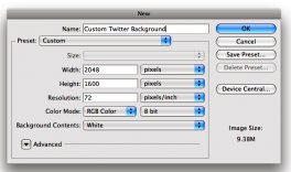
Open your design software, and create your new background using the following measurements:
It’s important to note that Twitter backgrounds will not scroll down as users scroll down a profile page. The text/images on the background will be glued to one spot and will never move.
 Step 2: Define Your Design Space
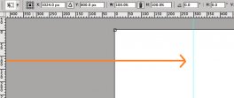
A blank canvas should now appear on your desktop. Now, due to the fact that a timeline or feed of activity exists on the center of every Twitter screen, we need to ensure that what we place on our background is never covered up by this feed. The trick here is to ensure that the text and images are viewable on any screen size (i.e. the feed doesn’t cut it off on a 13” screen laptop because the background was made on a 15” screen). To ensure you are always working in the “safe spot, ” pull out a marker over the 300-pixel mark on the horizontal ruler in your design software. To do so, simply click on the vertical ruler and drag until the line touches 300 on the horizontal ruler. This marker will not appear in your final product, it is simply an indicator for you to keep all your work inside that selected area. (If you're working off of a design software that does not have a marker feature, simply draw a line, and delete it after).


