 This post was originally published in 2009
The tips and techniques explained may be outdated.
A great looking abstract design can be created from the simplest of shapes. Let’s take a look at compiling various geometric shapes and objects to form a dynamic composition in Illustrator, then polishing it all up with some transparency effects to create a trendy vector illustration.
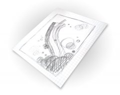
Start work sketching out a rough plan for the design, taking into consideration the composition and general style of the illustration.
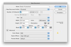
Open up Adobe Illustrator and create a new document. Choose a generic size such as A4, and set the Color Mode to RGB for a choice of nice, vibrant colours.
 Draw a 210x297mm rectangle onto the Artboard, align it centrally then add a soft grey to white radial gradient. This subtle addition gives a little depth to the design, rather than a boring flat white background.
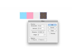
Pick out a colour scheme of your choice. Here I’ve used an ice-cream inspired mix of baby blues, pinks and a couple of complementing greys. Draw a square at 7x7mm, copy (CMD+C) and paste in place (CMD+F). Then, press the ENTER key to Move the square a set distance horizontally, enter 7mm into the options.
Tip: Use CMD+D after pasting a new object to repeat the last transform command.
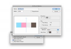
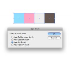
With all the coloured squares selected, click the New Brush icon in the Brushes palette. Select New Art Brush from the list.
 In the options panel, ensure the direction of the brush is correct. Click the small arrow buttons to alter the orientation of the brush flow.
With the Pen Tool, draw a smooth flowing line spanning from the bottom left corner to the upper third of the document.
With the path selected, click the recently created brush in the Brushes Palette to give a cool stripe effect.
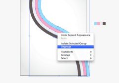
Go to Object > Expand Appearance to convert the path to a shape, then right click and Ungroup the objects.
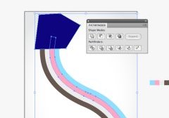
 Rather than have all the coloured stripes end abruptly, we want to tweak them to different lengths. Draw a temporary shape that crops off one of the stripes. With the shape and stripe selected choose the Subtract from Shape Area option in the Pathfinder.
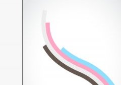
Repeat this process with the remaining stripes at different positions, giving varied lengths to the lines.
Add some depth to the stripes by changing the flat colour to a gradient. Add a couple of extra swatches that add lighter and darker tones. It’s handy to keep a copy of the original swatches to one side to allow quick and easy colour picking.
Begin to add some secondary elements to the design, such as a bunch of grey circles. Draw each shape at a different size to fill out the empty space.
Overlap this area with another collection of circles, this time choose a different colour from the palette. Add a subtle gradient to give some depth to these new shapes.

